AI You Can Trust: Bringing Clarity to AI Data Analytics

Location

NYC

Timeline

Jan 2024—May 2024

Role

Lead Product Designer

Team

4 Designers, 1 PM, 4 Devs

THE STORY

AI is powerful, but people don’t trust what they can’t understand.

At TextQL, a $4.1M seed-stage startup, I redesigned Ana, an AI data analyst that translates natural language into SQL queries. The goal was to help users trust AI-generated insights without losing control or clarity.

THE Solution

Making data work feel natural, not technical.

Ana allows analysts to ask questions like “What were our top campaigns last quarter?” and instantly get visualized results. I redesigned Ana’s dashboard to make that interaction feel simple, structured, and transparent, so AI felt like a teammate, not a mystery.

The solution we came up with that got shipped!

Translating queries

Ana translates the query into SQL, runs it, and returns clear visuals, summaries, and insights directly in the dashboard.

Personal Data

Ana acts like a personal data scientist, cleaning data, finding correlations, and surfacing outliers, all while keeping users in full control.

Product showcase

Ana

Ana is an AI data analyst that translates natural language questions.

THE OUTCOMES

Product shipped!

After rollout, the redesign led to measurable improvements such as 40% faster data exploration which streamlined navigation and clearer workflows

My Individual Contributions

Product Design, PM Collaboration, User Research

80+ final screens across Ana’s redesign

Led usability testing and synthesis

Defined design system

That was the TLDR; continue below for details!

Process Overview

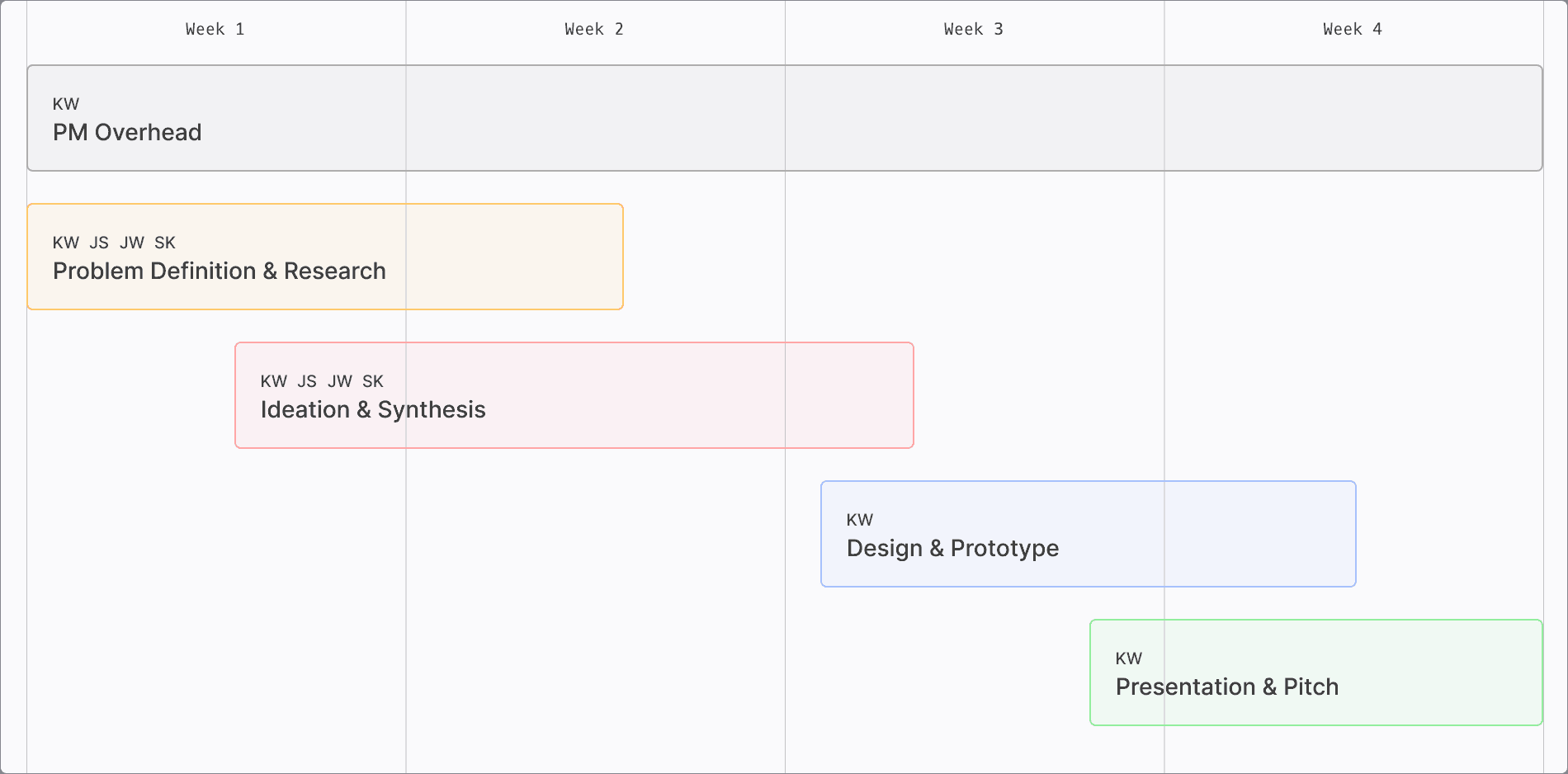
Timeline & Roles

Problem definition

Why Analysts Distrusted Ana

After 25+ interviews with data professionals from Google, PNC, JPMorgan, and Shell, we uncovered three recurring pain points:

  • Poor conversation context

  • Inefficient navigation

  • Overwhelming data presentation

Secondary Research

Understanding AI in Enterprise Data Workflows

We studied how large organizations used AI for analytics. Findings revealed a consistent truth: speed without transparency leads to distrust. This insight shaped our north star, make Ana understandable, not just intelligent.

Design considerations

Poor Conversation Context

The original Ana made it difficult to track which questions were answered or still open. I introduced threaded conversations and contextual suggestions like: “Show me a visualization,” “Add to dashboard,” or “Let’s keep going.” This guided users through analysis naturally, improving flow and comprehension.

Inefficient Navigation

The old design had two overlapping sidebars that confused users.
I restructured navigation into a single unified system organized by threads.
Now, users could seamlessly switch between analyses, view history, and search results, without losing their place.

Overwhelming Data Presentation

Analysts were overwhelmed by unformatted data. I redesigned the layout with clear visual hierarchy, expandable result sections, and hover-based details for SQL logic. This created a balanced experience, comprehensive yet approachable.

Responses feel disconnected

Hard to track previous insights

Not intuitive

Navigation on both sides

Too much info at once

Difficult to prioritize insights

Ideation

Round 1

The original Ana made it difficult to track which questions were answered or still open. I introduced threaded conversations and contextual suggestions like: “Show me a visualization,” “Add to dashboard,” or “Let’s keep going.” This guided users through analysis naturally, improving flow and comprehension.

Design A

Design B

Design C

100% of users notice the design,

but 80% admitted they did not read

the information

Only 30% found it engaging enough

to continue further

65% of users noticed and

understood more effectively

Some users mistakenly thought the

feature signaled the end

PIVOt

Changing our choices

Mid way through our initial ideation. we were faced with a mid contract pivot where I had to work with the engineering and pm teams as a leader because of

  • Real-time dynamic previews caused performance issues

  • Negotiated a pivot → “preview-on-demand”

  • Preserved clarity, improved performance

Ideation

Round 2

Post pivot, I was tasked by the client to come up with drastically different ideation that now incoropartes the feedback we got from the developers and pms. I then came up with the following designs and user tested them to see which would be the most optimal for this platform.

Design A

Design B

Design C(Winner!)

70% of users preferred this design

for its clean concise layout

20% wanted more information

visible upfront

30% preferred this design for its visibility

60% of users felt this was cluttered and occupied excessive space

Final Designs

Before & After

The once cluttered double navbar, now has a simplifed interface, where users can access the main point of the platform easily, which is Ana.

Before

After

Navigation

By gathering data on what technical users actually ask, the conversation flows better due to now prompted follow-ups.

Before

After

Conversation Context

Because of cluttered UI, among other factors, the once unreadable data presentation has now been structured to format the files given.

Before

After

Presenting Data

end Credits

The warmest thank yous

This project was one of my first ever shipped projects. Leading a team of 4 designers while working with AI was such an incredible experience. It truly taught me so much about working with engineers and pms along with other designers as well. I am so grateful to be part of such an innovative product and am happy with all that I have learned from it.